Monday 20 April 2015

Final article page

 
This is my final article page that I created using Adobe InDesign.  


Friday 17 April 2015

Final article title page


This is my final article title page for my music magazine that was created on Adobe Photoshop.

Final contents page

This is my final contents page for my music magazine, that I created on Adobe Photoshop.


Final front cover

 
This is my final front cover page, that I created on Adobe Photoshop.

Evaluation question 7: Looking back at your preliminary task, what do you feel you have learnt in the progression from it to the full product?

Powered by emaze

Evaluation question six: What have you learnt about new technologies from the process of creating this product?


Article title page progression: part five.

 
Following my response from a member of my target audience that answered my questionnaire, I have made suitable changes to my article title page so that it is more suited to my target audience. When asked if there were any things that she thought would improve my article title page, she responded by saying that there could be the magazine website address down the side of the page, and the quote on the image could be a little bit smaller. Therefore, I slightly reduced the size of the quote, so that it wasn't so big but there wasn't a drastic change in size. I also added the website link down the right hand side of the image, so that readers are reminded that there is extra information available on the website.


Front cover progress part six

 
As I produced a filmed response of a member of my target audience answering a questionnaire on her thoughts on my music magazine, I decided to make some changes to my front cover so that it suited my target audience better. She answered that the only thing that she would change about my front cover is that she would like to see a price visible at the top of the page. Therefore, I have added my chosen price, which is £3, in the top right hand corner of my page.


Wednesday 15 April 2015

Evaluation: Target audience response part four

Evaluation: Target audience response part three

Evaluation: Target audience response part two

Evaluation: Target audience response part one

Evaluation: Target audience questionnaire.

In order to find out what parts of my magazine are successful with my target audience and which parts are not, I have created a questionnaire that will be answered by my target audience. This will not only tell me which parts are successful, but will inform me on what can be improved on my magazine and what can be added. 

1. How old are you?

2. In your opinion, do you think the front cover of this magazine is attractive?

3. Do the articles featured on the front cover interest you and make you want to purchase the magazine?

4. Do the fonts on the front cover stand out to you?

5. What can be improved or added to the front cover?

6. Does the layout of the contents page look organised and is it clear?

7. Are the font sizes on the contents page clear and easy to read?

8. What do you think about the images featured on the right hand side of the contents page?

9. Is the colour scheme throughout the magazine consistent?

10. What can be improved or added to the contents page?

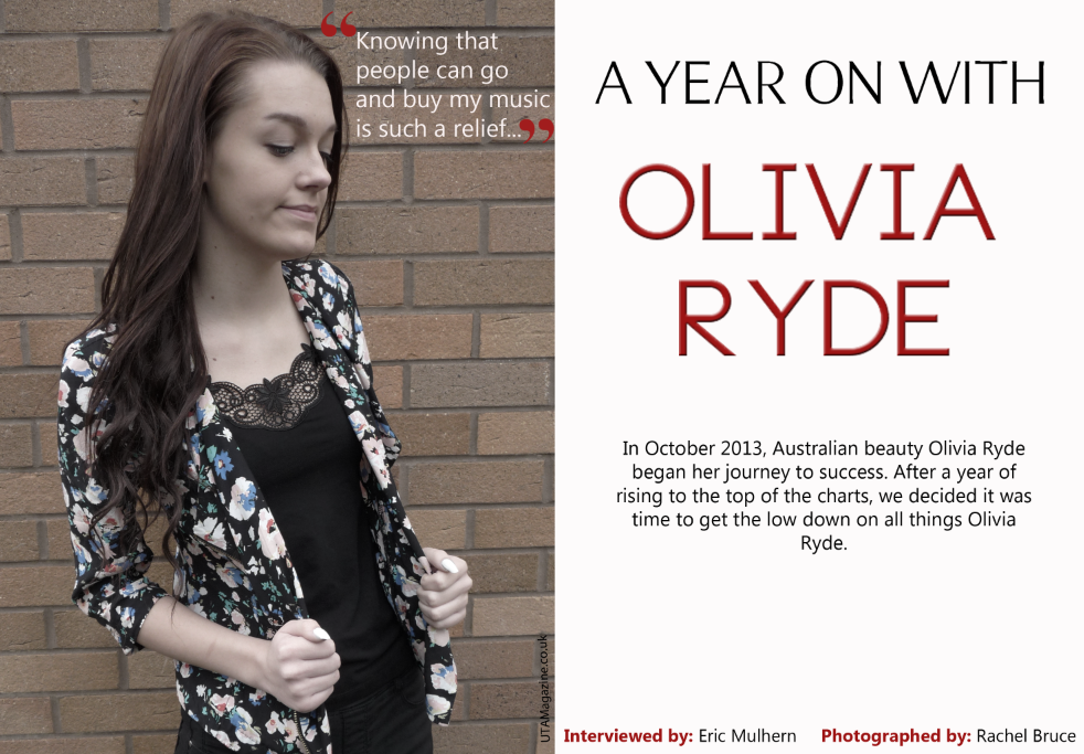
11. Does the right hand side of the article title page look too bare? 

12. Are the colours of the image on the left too dull in comparison to the magazine colour scheme?

13. Is the font size of the quote that is on top of the image too big? 

14. Is the introduction to the article too brief?

15. What can be improved or added to the article title page?

16. Is the layout of the article page organised and easy to read?

17. Do you think that the image on the article page should be the same shade as the image featured on the title page?

18. Does the big letter underneath the text make it difficult to read the article?

19. Is the article too short?

20. What can be improved or added to the article page?

Evaluation question five part four: How did you attract/address your audience?

The website that is dedicated to my magazine is featured on the pages of the actual magazine. This allows readers to gather even more information on things featured in my magazine and it encourages interactivity. Interactivity encourages the audience to develop a sense of ownership of the magazine, therefore they are more likely to buy it. As well as this, it also allows them to identify with the magazine and it allows them to form friendships with other readers from all over the world, due to the website.
There are certain features on my music magazine's website that would attract an even larger audience. My website would include free music downloads for readers of the magazine, which will automatically draw in a bigger audience so they can access free music. It would also include a message board where viewers can post their views on the magazine and who they would like to see featured in the next issue of the magazine. This allows readers to feel involved with the production of the magazine, meaning they are more likely to buy the magazine. Not only this, but as it is a message board, readers will be able to interact with each other and form relationships.
To entice a larger audience, my website will also include exclusive interviews with featured artists in the magazines and they are able to enter competitions to win signed merchandise by their favourite artists, and even concert tickets. This is a gimmick that will immediately entice a larger audience to buy the magazine, as fans of the featured artists will automatically want to join the competitions and view the exclusive interviews. 

Evaluation question five, part three: How did you attract/address your audience?


Evaluation question five, part two: How did you attract/address your audience?


Evalution question five, part one: How did you attract/address your audience?


Evaluation question four: What would be the audience for your media product?

My primary target audience for my music magazine is 16-25 year olds. I have re-posted the reader profile that I created for my magazine, as it explains what type of interests that the target audience that purchase my magazine will have.

As my primary target audience is more of a younger generation, their income will be considerably low compared to a mature adults income. My magazine is mostly targeted towards middle class females, however it could also attract the attention of some males. This means that most of their money will most likely be wasted as they don't have many responsibilities that require money. Therefore, they will probably spend their money on things such as clothes, beauty items, technology, food, music, magazines etc. 

My secondary audience will be people aged from 27-35 year olds. This is because not all people at the age of my primary target audience will enjoy the styles of music that are included in my magazine. However, slightly older people also may enjoy these styles of music and could be interested in purchasing my magazine.

Evaluation question three: What kind of media institution might distribute your media product and why?


Editing the image: Article page


Saturday 11 April 2015

Editing the image: Article title page.

Before

After

To edit this image of my model to go onto my article title page, I used Adobe Photoshop. First, I slightly cropped the image so that there wasn't so much excess background and so that it would fit properly onto my title page. I then altered the colour of the image slightly to drain some colour out of it and make it almost black and white, however slight flecks of colour are still visable. I achieved this by bringing down the contrast and saturation, and I also brought down the level of certain colours in the image such as yellow and red.